 By
·
4 minute read
By
·
4 minute read
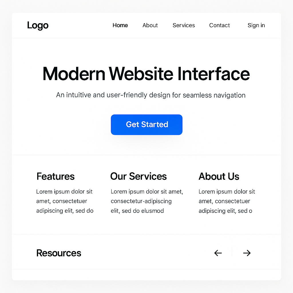
Effective website navigation is the invisible thread that guides visitors seamlessly through your digital ecosystem, transforming confused clicks into confident conversions.
The strategic foundation of intuitive navigation
Good navigation starts with understanding how people actually think about your content, not how your org chart is structured. The goal is simple: visitors should be able to predict where things live and move toward their goal without stopping to think, “Where on earth would they put that?”
That means your information hierarchy needs to match user mental models. Not your internal departments. Not your product lines. When you get this right, people feel like the site “just makes sense” — they click once or twice and they’re where they expected to be, with no friction.
Depth versus breadth is one of the first real decisions. In our experience, broader, shallower structures usually beat deep, narrow ones that force people through five or six clicks to reach the good stuff. As a rule of thumb, aim to keep critical content within about three clicks, but don’t sacrifice clarity just to hit a number. If you have to choose, clear beats clever every time.
Simple research exercises like card sorting and tree testing are worth their weight in gold here. They show you how your actual audience groups topics and what labels make sense to them. You’ll often discover that what your team calls something internally bears no resemblance to how customers think about it. Doing this work up front costs far less than finding out after launch that people can’t find what they need — and quietly abandoning the site because of it.
Mobile-first navigation for how people really browse
Most of your visitors are on mobile, or close to it. So mobile navigation can’t be an afterthought or a “shrink the desktop menu” exercise. Designing mobile-first forces you to decide what’s genuinely essential, strip back menu options, and make touch interactions easy on a small screen.
Hamburger menus are everywhere, but they’re not always the best answer. In plenty of cases, fixed bottom nav bars, simple tab bars, or “priority+” menus (where the most important items stay visible and the rest tuck away) outperform a hidden menu because the key paths are always in view. The right pattern balances visibility with space — your main routes should be obvious without turning the screen into a wall of links.
A good responsive system adapts gracefully across breakpoints: stacked menus on mobile, hybrid layouts on tablets, more traditional horizontal nav on desktop. Progressive disclosure — showing a bit, then letting people drill down — keeps things from feeling overwhelming while still giving access to depth. Breadcrumbs help people see where they are and jump back without hunting.
And don’t just test this on a blazing-fast desktop connection. Load your site on a mid-range phone over 4G and see how it feels. Slow responses, jumpy menus, or tap targets that are too small are exactly the things that cost you conversions in the real world.
Clear visual hierarchy and strong “information scent”
Visual hierarchy is the quiet workhorse of navigation. Size, weight, colour, spacing, and position all tell people what matters and where to look first. Primary nav items should stand out clearly. Secondary and tertiary options should still be visible, but they don’t need to shout.
“Information scent” is the idea that each link or label should give off a clear hint about what you’ll find if you click. Strong scent means people move with confidence. Weak scent means they hesitate or give up. Labels like “Solutions” or “Resources” might feel tidy internally, but they’re vague for users. Specific, descriptive labels almost always win over clever wording in tests.
Consistent styling and behaviour across the site lowers cognitive load. When a type of link or menu behaves the same way everywhere, people build a mental model quickly and reuse it on every page. When patterns change for no good reason, they have to stop and relearn. That friction adds up. Simple design standards for navigation components — and a team that sticks to them — go a long way.
Strategic menu design and sensible categorisation
Your menus need to walk a line between “not enough” and “far too much”. Show enough options for people to orient themselves, but not so many that they freeze. Hick’s Law tells us the more options you show, the longer it takes to decide. In practice, streamlined menus usually mean faster decisions and better flows.
Group related items under clear parent categories so people can quickly ignore what doesn’t apply and hone in on what does. For large sites, mega menus can work well — if they’re done properly. A good mega menu lets people see the shape of your content at a glance and jump straight to what they need. A bad one is just a dense grid of links that makes everything harder. The difference is in scannable layouts, logical groupings, and smart use of headings and whitespace.
Language matters here. Category labels should use the words your customers use, not internal jargon or marketing phrases. Mining search queries, support tickets, and sales call notes is one of the fastest ways to find that language. Once you’ve got a few good candidates for labels, A/B test them. The data will tell you which terms actually drive clicks and engagement.
Performance and analytics: keeping navigation honest
Navigation design isn’t just UX and UI — it’s performance too. If your menus are slow to appear or feel laggy, people notice. On mobile networks, a heavy navigation system is often the first thing that breaks the experience.
Optimise the technical side: keep nav code lean, load critical elements first, and lazy-load what can wait. Make sure your CSS and scripts for navigation don’t block the page from becoming usable. The aim is simple: from the user’s point of view, the main navigation should feel instant.
On the measurement side, treat navigation like any other key part of your funnel. Track clicks on nav items. Look at which paths people actually use and which elements they ignore. Combine analytics events with heatmaps and session recordings to see the real journeys people take — and where they get stuck or backtrack.
Define a small set of KPIs for navigation: things like menu engagement rates, time to reach key pages, common exit points, search usage when navigation fails, and where people abandon multi-step flows. Review these regularly. When you see issues emerging, test focused changes rather than jumping straight to a full redesign.
Navigation shouldn’t be a once-every-five-years project. The most effective sites treat it as ongoing work: make a hypothesis, change one thing, measure, refine, repeat. As your content, audience, and business priorities evolve, your navigation should evolve with them — quietly doing its job, helping visitors find what they need, and earning its place in your overall conversion story.